I'm using the photo from Martha Stewart Weddings as a color reference. This picture is actually a little tricky because of all the white and blue (sky, mountain, snow, dress), so my painting will have to break away from that a little bit.
First, assemble the supplies:

I use Windsor and Newton watercolor paint, which I find holds the pigment well, lasts a long time, and is easy to carry.
My brushes, collected over the years.

An old episode of Project Runway (P-ject R-way!).

First, I start with the sky. Some people are masters at manipulating and layering the paint so that it looks like there are clouds and depth. I am not one of those people. My goal is to get it on there without looking too crazy.

I like to work in blocks, allowing one section of the picture to dry before I move onto another one. Here, while I wait for the sky to dry, I add little details of color on the snow.

Then it's back to the mountain, for the same details. It's a little hard to see in this picture, but each section has its own slightly different blue. The blue of the sky is a deeper, purer blue, while the blue of the mountain is a grey-blue with some yellowish hints. The blue of the snow has a slight tint of purple.

Prepping my brush for a dry application of detail on the mountain. It's important that the mountain section be completely dry before I apply the brown paint.

You can see a little of the mountain detailing in the back of this picture. Also, skin!

I like my brides to have pink cheeks. All it takes is a little drop of color.
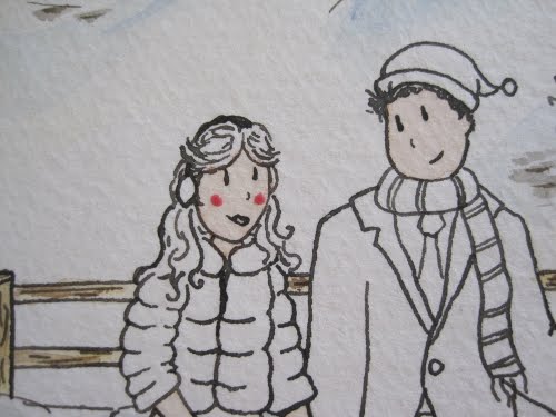
Which then gets blended in. Like with the line drawing, the faces here are very important. The background can look pretty, but you better believe the bride and groom have to be the best-looking things out there.

Pink cheeks for the groom, too!

Blonde hair, and some detailing on the jacket. The jacket is white, but like the snow, the shadow it casts is blue. This is one of the reasons why it's very helpful to have a reference photo, since, not often going out in the snow in white fur jackets, I might have otherwise missed this detail.

The dress! It has to look more ivory than white, in order to stand out from the snow.

A full view. Here I added in the fence and some green trees on the mountain.

The groom! I love putting in red accents. It really makes the whole picture pop, but the thing with red paint, it has to be the *last* thing you apply. If it's even a little damp, the red pigment will leak and stain, and red has a tendency to spread. This is true even if you apply something on top of the red. Wait until the end. Let it be an accent.

The completed painting! This one has been slightly color-corrected on my computer, which is an extra service I offer. There's nothing wrong with the finished painting as is (text to be applied in the printing process), but I find tweaking the colors slightly, upping the saturation so it's brighter than reality, can brighten and liven up the image.

Here's some sample text to give you an idea of what the invite will look like as printed (10 points to whoever gets the reference to the bride and groom!).

And there you have it! A beautiful invite, from start to finish, ready for a couple of ski bunnies!
No comments:
Post a Comment