I love using the black ink to outline everything. I know a lot of people disagree and prefer to just paint, which is also beautiful. For me and my style, though, I think it looks nice to have a little more definition. It makes it look a little more cartoony, it gives it some dimension and structure, and the ink makes the picture really come alive.
I use Higgins waterproof black calligraphy ink.

I do not love it. I've been long-searching for a nice, black, substantial ink that's waterproof, fade proof, and doesn't gunk up my pens. I'm still searching. If anyone has any suggestions, I'd be pleased to hear them.
My favorite nib.

I used to live in fear that I'd break it or lose it and then forget what kind it was. Then I had the bright idea to just buy a few spares. This nib will do nothing for calligraphy but draws beautiful, clear, even lines and holds a lot of ink. It is extremely cheap and I would not trade it for anything. I'm sure calligraphy-snobs somewhere would turn their noses up at it. But it works for me.
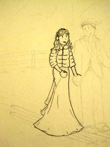
I start with the face. Like with the drawing, if I mess it up, it's back to the (literal) drawing board. As in, just throw the damn thing away. There are a lot of things you can fix to salvage the rest of the drawing. Lazy-eyed brides are not one of them.
I love the ink because, unlike with the pencil, there's a spontaneity and unpredictable quality. The ink goes where it wants to, and you get to try to figure it out. A line that looks fine in pencil can be changed with ink, made more stylish and interesting. It's so satisfying to see the ink transform the drawing.
And here's the groom. On the pant legs you can see the ink is a little more faded than I'd like it to be. Need to find me something better... And yes, I gave them smittens.

The background. It doesn't need much.

And a few more trees and details.

All it needs is to erase the pencil lines, and we're done!
There's nothing stopping this being the actual invite (except for, you know, words). It could easily be colorized or printed with white or black ink on colored paper. But, the watercolors will look amazing.
A note on the words: I don't especially like the idea of putting the text right into the drawing. I toyed with the idea for my own invites for a long time and finally decided against it. In part, I had found a font that was perfect, but I also worried about clarity, color, making mistakes. It's easy to change text in a computer if you misspell something or need it to be bigger, but once it's a part of a drawing, it's in there. For this invite I'll be making a separate text file to show how it's done, but for my next, I plan on going the daunting text-in-image route.
No comments:
Post a Comment